Still Haunting:
What Nearly 30 Years Taught Me About Designing a Logo That Lasts
By Drake Newkirk,
Creative Director & Brand & Digital Design Leader
September 2026

The Philadelphia Phantoms identity was created in the mid-1990s. Nearly three decades, three markets, two Calder Cups and countless applications later, the core mark is still alive — and recently turned up in an episode of Reacher. That kind of longevity says more about a design than any speculative redesign ever could.
A few nights ago, I was watching Reacher when something familiar appeared on screen.
There it was: the Phantoms logo.
Not in a design retrospective. Not in an archive. Not in a “remember the ’90s?” montage. It was on a T-shirt being worn by a character in a current television series set in Philadelphia.
Season 4 of Reacher has leaned heavily into Philadelphia. The production filmed at actual locations throughout the city, and in Episode 6 a character appears wearing a Phantoms shirt — a small but unmistakable piece of Philadelphia hockey culture.
For a designer, moments like that are hard to describe.
I developed the original Philadelphia Phantoms identity in the mid-1990s, when the Flyers were establishing a new American Hockey League franchise. The assignment wasn’t simply to make a minor-league hockey logo. The challenge was to create something that belonged to the Flyers organization while having enough personality to become its own brand.
Nearly 30 years later, it still does.
You can create a logo. But you can’t create longevity.
Time decides that.
Seeing the mark surface so casually — without explanation or nostalgia — brought me back to the decisions that shaped it in the first place. It was also a reminder that the real test of an identity isn’t how it looks when it launches, but whether it can keep meaning something decades later. So I decided to revisit the mark and tell a little of the story behind how it came to be.


The Phantoms needed an identity of their own, but they also needed to feel unmistakably connected to the Philadelphia Flyers organization. That relationship had to be visible without making the new team feel like a secondary version of the Flyers.
At the heart of the identity was the logo: The Phantom would be represented through a goalie-mask-like face, with the Philadelphia Flyers’ familiar wing forms incorporated into the sides. The relationship between the organizations would be visible immediately, but the Phantoms would have their own independent personality: darker, more aggressive, stranger and a little more intimidating.
And there’s one detail most people never knew: the Phantom’s eyes were actually based on mine.
That fusion created continuity with the parent franchise while giving the Phantoms an intimidating, spectral presence entirely their own.
The mask wasn’t simply a graphic device. It carried the story.
Speed. Fearlessness. Menace. The feeling of something haunting the ice.
The Flyers connection was there in the wings, but the personality belonged to the Phantom.
That distinction mattered. The goal wasn’t to borrow equity from the Flyers and stop there. It was to create something capable of developing its own equity.
Over time, that happened.
The identity extended far beyond the primary mark into uniforms, merchandise, mascot concepts, environmental graphics and the broader visual language of the team. It was conceived as an identity system from the beginning, not simply as an isolated logo intended to look good on a presentation board.
And then the most important part happened.
People adopted it.


Early concepts
The original Philadelphia Phantoms began play in 1996.
The franchise later moved from Philadelphia to Adirondack and eventually to the Lehigh Valley, where it plays today as the Lehigh Valley Phantoms.
But there is an important continuity that can easily be missed when discussing the evolution of the identity:
The Phantoms never left the Flyers family
Philadelphia became Adirondack. Adirondack became Lehigh Valley. Arenas changed. Markets changed. Uniform systems and supporting graphics evolved.
But the team remained the Philadelphia Flyers’ American Hockey League affiliate.
And the Phantom remained.
That makes the longevity of the original concept especially meaningful to me, because the logo was designed from the beginning to communicate precisely that relationship.
Nearly three decades later, the organizational relationship the logo was created to express is still there.
So is the essential visual idea.
The identity has traveled.
It hasn’t lost its lineage.


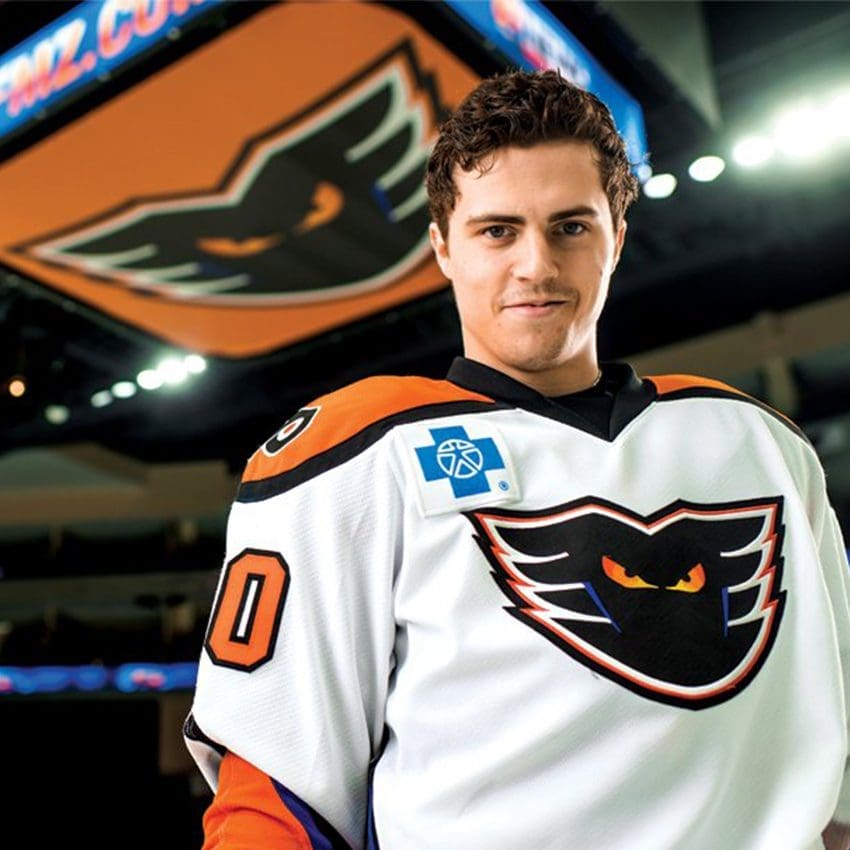


Logo in environment
Designers spend a great deal of time talking about grids, geometry, balance, symmetry, simplification, scalability and stylistic relevance.
Those things matter.
But there is another measure of a successful identity that is much more difficult to demonstrate in a portfolio:
And eventually, does it become so naturally associated with a place and a culture that a television wardrobe department can put it on a character without needing to explain it?
Those are branding questions.
Not merely graphic-design questions.
The Phantoms logo has been screened, embroidered, painted, printed, animated, enlarged, reduced and reproduced in more situations than I could have imagined when I developed it.
It has lived through the visual excesses of the 1990s, the wave of minimalist corporate redesigns that followed, the rise of digital-first identity systems and the current obsession with stripping logos down to their simplest possible geometry.
And it is still working.
That doesn’t mean every curve is mathematically inevitable.
It means something much more valuable happened.
The mark became owned.
Not legally. Culturally.
Fans made it theirs.
There is another distinction worth making, especially for younger designers who encounter branding through speculative redesign content like this., like this one.
A speculative redesign and a real identity assignment are fundamentally different exercises.
A redesign begins with something enormously valuable already in place: Recognition.
The redesign can select which pieces of that accumulated equity to keep, simplify, exaggerate or discard.
Creating the original identity is a different problem entirely.
You have to invent the thing people may eventually become nostalgic about.
You have to decide what the story is before anybody knows the story.
And then you have to build an identity strong enough to survive real-world use.
That is considerably harder than correcting Bézier curves after several decades of brand equity have already accumulated around them.
One of the peculiarities of contemporary design culture is that visibility can easily be confused with validation.
A redesign can accumulate views because transformation makes good content.
Before-and-after imagery is inherently compelling.
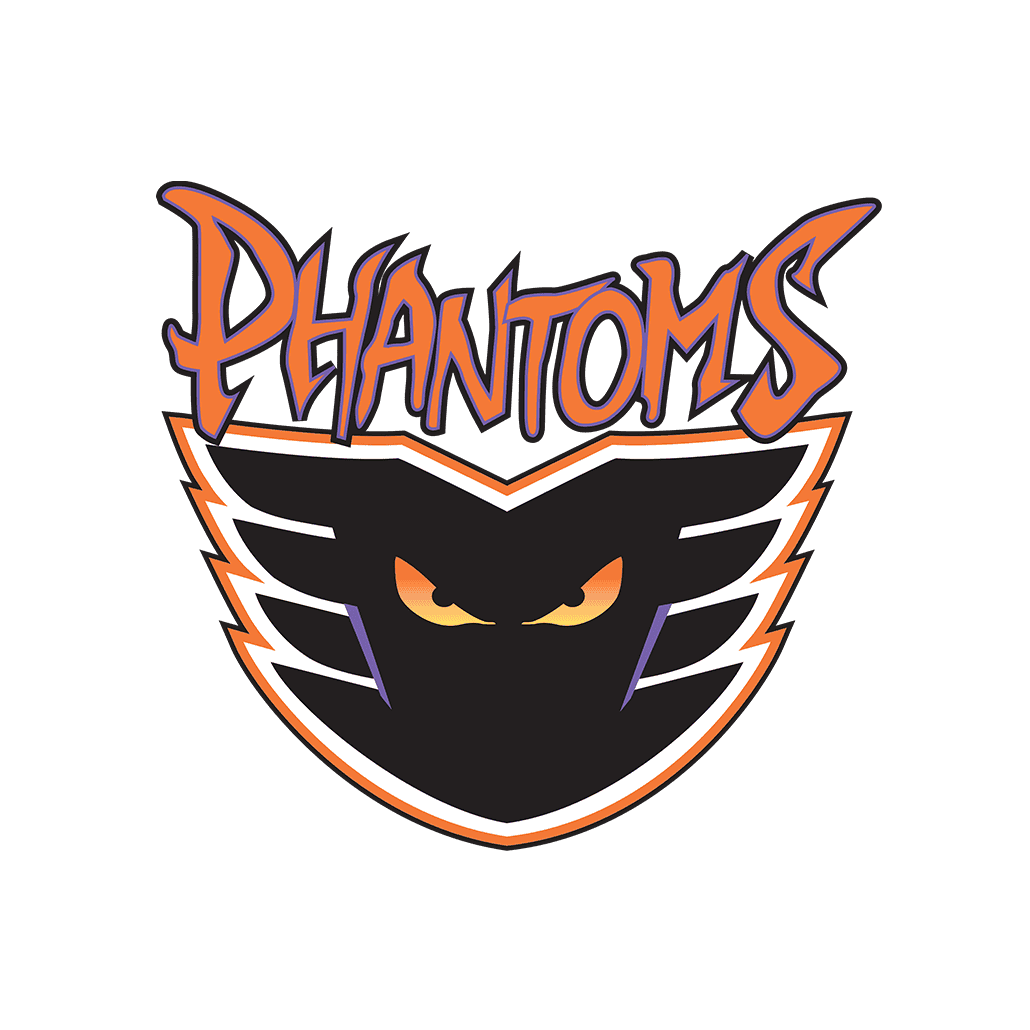
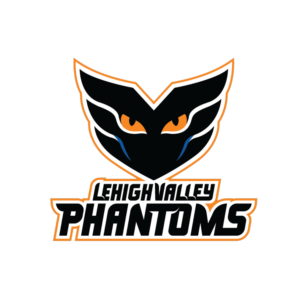
Original vs Redesign Concept
“Fixing” a recognizable logo gives viewers an immediate point of comparison.
A provocative premise creates engagement.
None of that tells us whether the new identity would actually perform better in the marketplace.
Social-media engagement and brand effectiveness are not the same metric.
A speculative redesign gets judged in seconds on a screen.
An actual identity gets judged over years by fans, clients, licensees, manufacturers, broadcasters, sponsors and the countless people who encounter it without ever thinking about graphic design.
The Phantoms logo has had almost 30 years of that evaluation.
And decades later, it can appear for a few seconds on television and immediately communicate something about Philadelphia hockey culture.
That is a rather different kind of design critique.
This is the part of branding that can be difficult to see when we look only at the artwork.
Eventually, a successful logo stops being merely a drawing.
It becomes attached to experiences.
None of those associations are contained in the vector file.
But they become part of the mark.
That is why established identities deserve to be evaluated differently from new ones.
At some point you are no longer redesigning shapes.
You are redesigning memory.
That doesn’t mean logos should never change.
Of course they should.
Brands evolve. Organizations change. Reproduction requirements change. Sometimes an identity genuinely stops doing its job.
But age by itself is not a design problem.
And longevity is not evidence that nobody bothered to redesign something.
Sometimes longevity is evidence that the original idea was strong enough that nobody needed to.
Which brings me back to the television screen.
Reacher was filming in the Philadelphia region, and there on a character’s shirt was the Phantoms identity.
It simply belonged there.
And perhaps that is the part I appreciated most.
The identity had crossed over from being something I once designed into being a small artifact of Philadelphia culture.
Even though the team now plays in the Lehigh Valley, it remains the Flyers’ AHL affiliate. The connection to Philadelphia hockey continues, just as the original identity was designed to communicate.

So when the Phantom turns up in a Philadelphia story almost 30 years later, it doesn’t feel like an arbitrary piece of nostalgia.
You create the strongest idea you can, give it a distinctive visual voice, make sure it works in the real world — and then you let it go.
If you’re fortunate, people take it from there.
Nearly three decades later, the Phantom is still on the ice.
Still on the merchandise.
Still connected to the Flyers.
And now, unexpectedly, still turning up on television.
Still recognizable. Still relevant. Still haunting
I’ll take that over “modernized” any day.
Whether you remember the Phantoms identity from its early days or are seeing it with fresh eyes now, I’d love to hear what you think. What made it last?

About the author
Drake Newkirk is a Creative Director and Brand & Digital Design Leader whose work spans identity, digital experiences, campaigns, and integrated brand systems. He developed the original Philadelphia Phantoms identity in the mid-1990s.

Leave a Reply
Want to join the discussion?Feel free to contribute!