ARDENT CREDIT UNION
Evolving a Brand Through Digital Experience
CREATIVE DIRECTION • BRAND EVOLUTION • DIGITAL DESIGN • UI/UX
A bolder digital presence. A stronger connection between brand, products, and people.
Beyond a Visual Refresh
A brand is never static. As its products, services, and audience evolve, so should the experiences that bring it to life.
Ardent Credit Union has built its identity around a simple but powerful belief: Grit Makes Great. It’s a philosophy that reflects the organization’s commitment to doing more for its members, challenging convention, and making financial services more accessible.
The opportunity was to bring that same energy and personality more consistently into Ardent’s digital experience.
As part of an ongoing brand evolution, I led the creative direction and UI redesign of Ardent’s website, introducing a more distinctive visual language, greater consistency across the experience, and a stronger foundation for showcasing the credit union’s products and services.
The Challenge: Connecting Brand and Experience
Ardent’s existing website served an important role in communicating products, promotions, resources, and member services. But as the brand continued to evolve, the digital experience needed to evolve with it.
The challenge wasn’t to reinvent Ardent. It was to strengthen the connection between an established brand identity and the way people experience it online.
That meant creating a more cohesive visual system, establishing clearer content hierarchies, and giving financial products and services a more compelling presence—all while preserving the familiarity and functionality of the existing website.
The Approach: Building a Stronger Digital Identity
Rather than approaching the project as a complete website overhaul, I focused the first phase on establishing a more expressive and consistent design foundation.
The direction builds on Ardent’s established brand elements—its distinctive purple palette, energetic yellow accents, confident typography, and angular graphic treatments—to create a more unified digital experience.
Key areas of focus included:
- Brand Expression: Strengthening the use of color, typography, imagery, and graphic elements to create a more recognizable Ardent experience.
- Visual Hierarchy: Refining layouts and content presentation to bring greater clarity and emphasis to key messages.
- Product Visibility: Introducing more structured and engaging ways to showcase financial products, services, and featured offerings.
- UI Consistency: Establishing a more cohesive approach to cards, buttons, calls to action, and reusable content components.
- Design Scalability: Creating a visual foundation that can support future improvements to content organization and user journeys.
The goal was to make the website feel less like a collection of individual pages and promotions, and more like a connected expression of the Ardent brand.
The Transformation: A More Confident Digital Experience
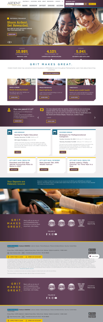
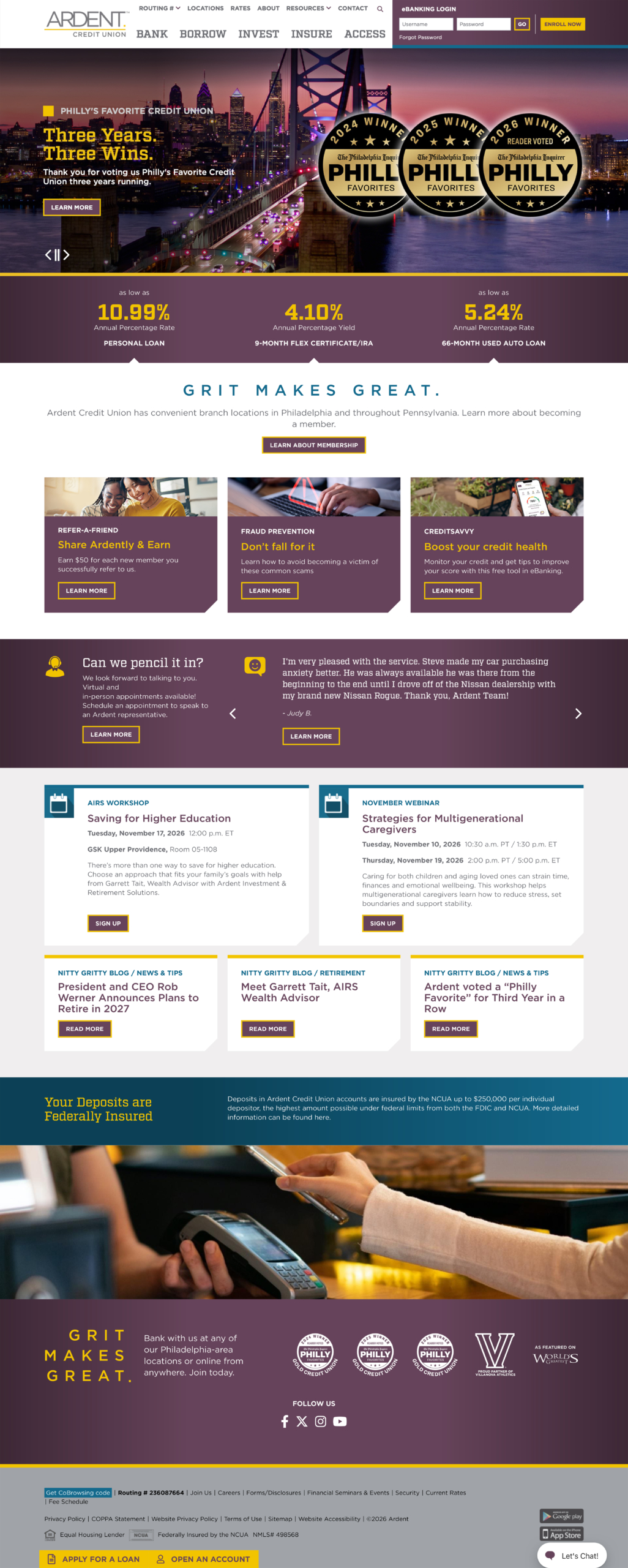
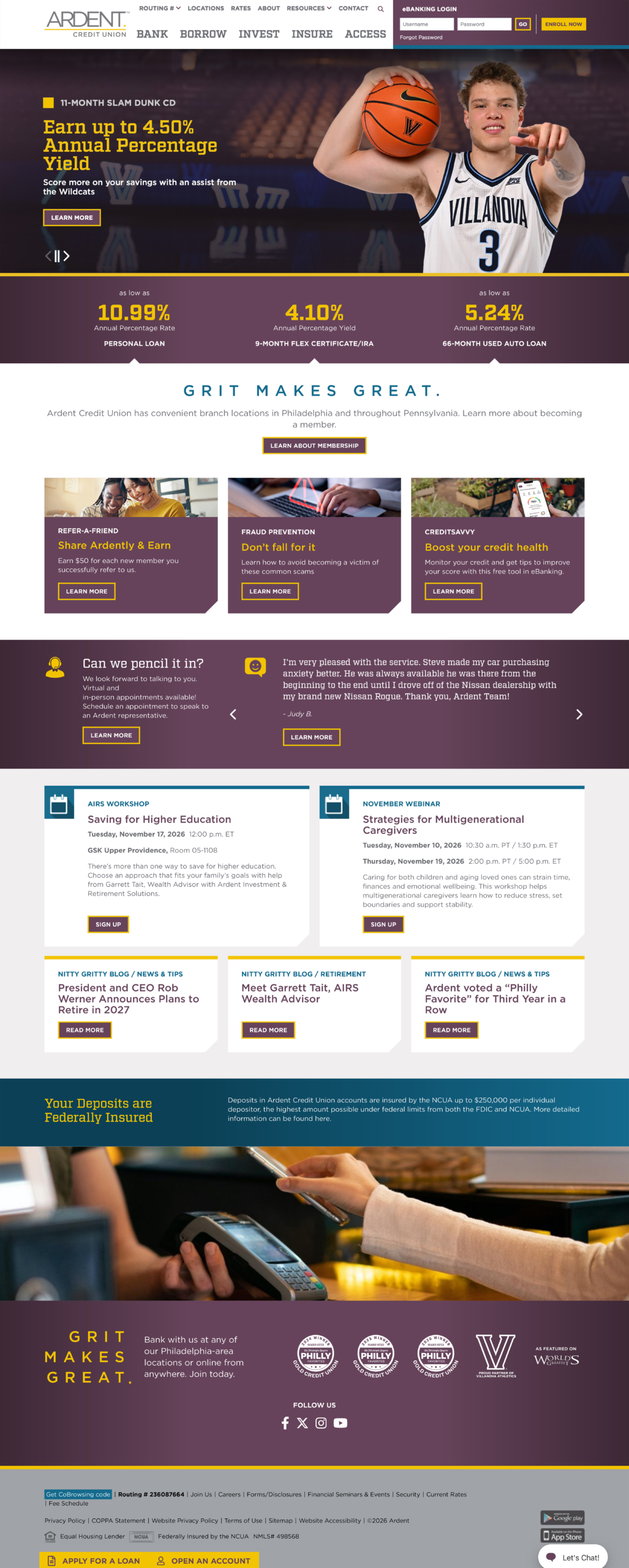
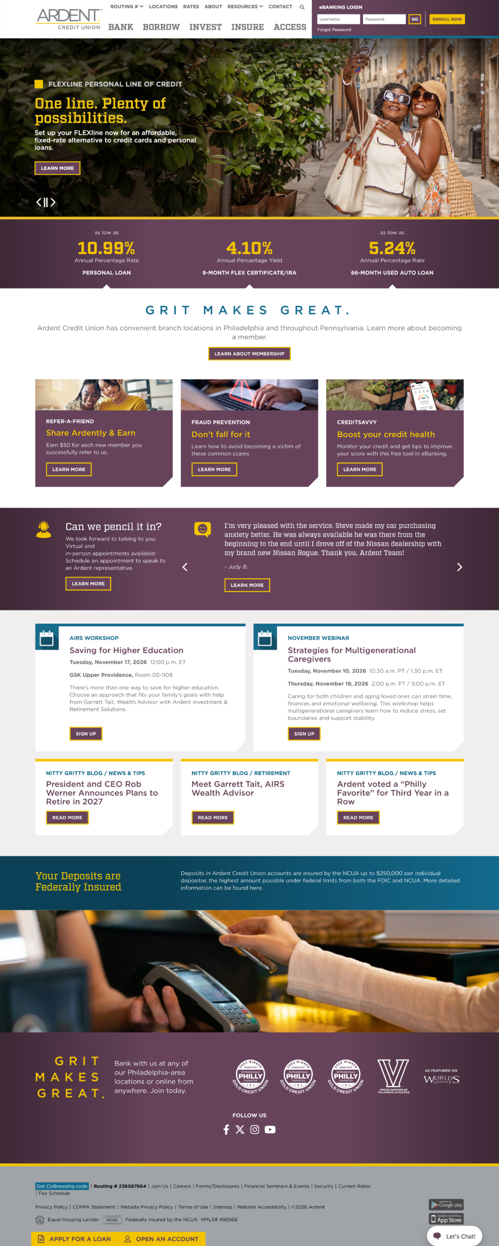
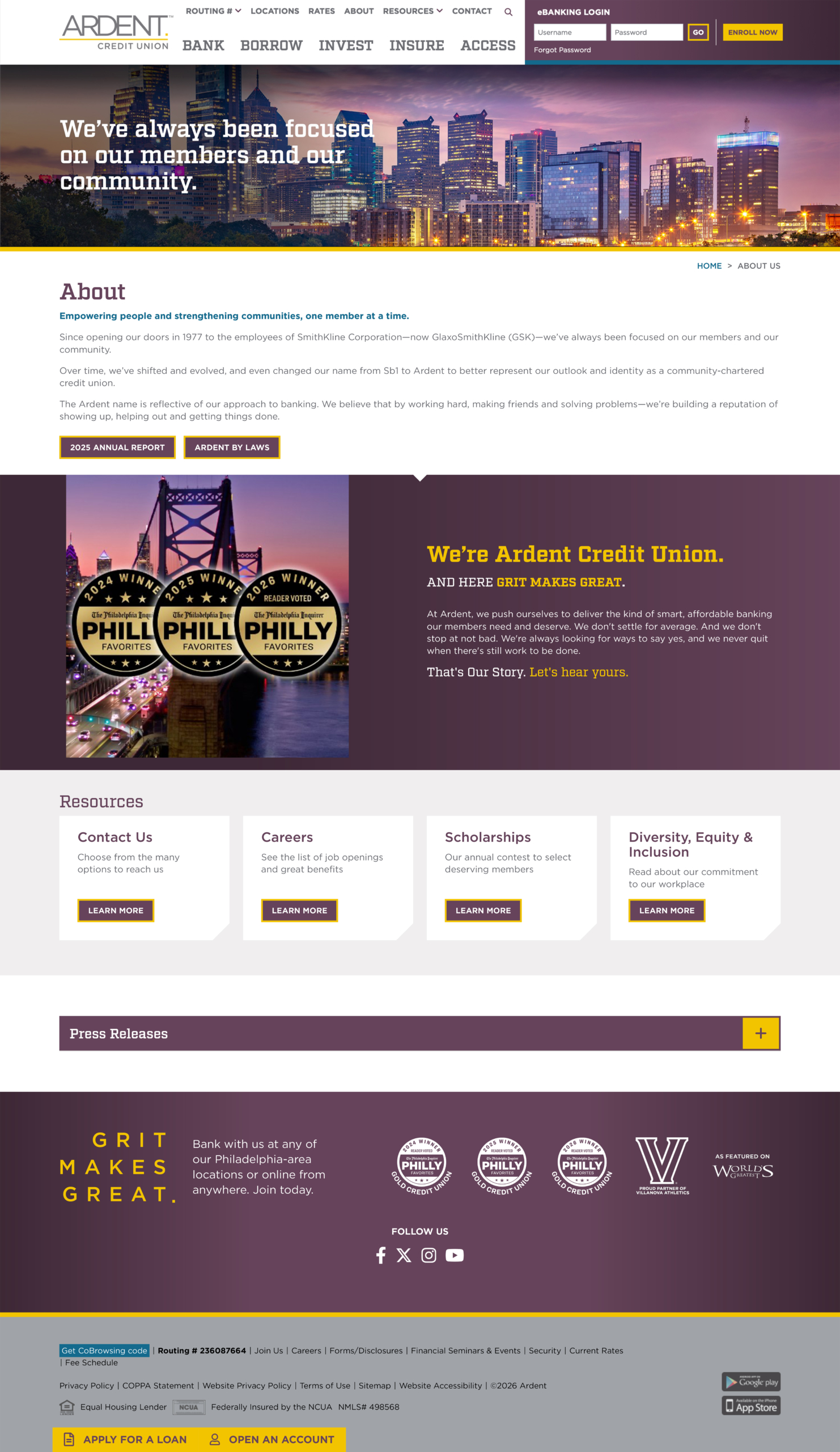
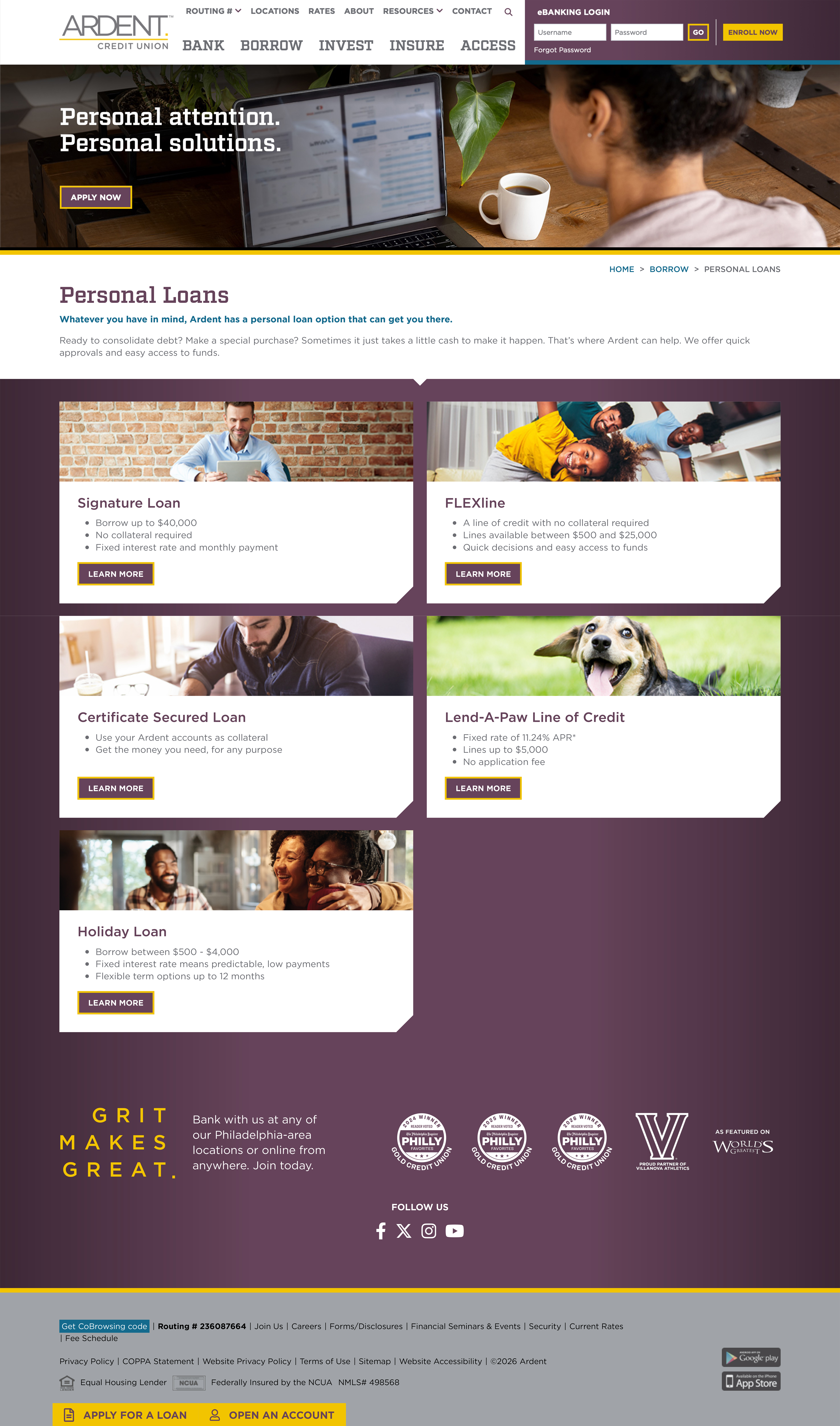
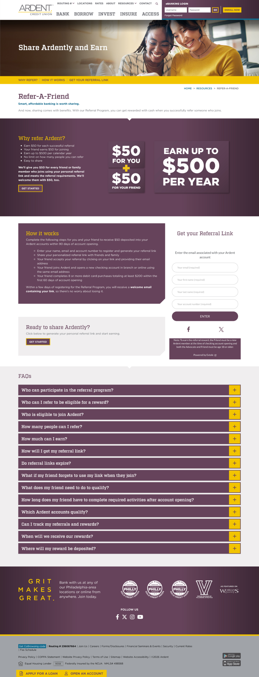
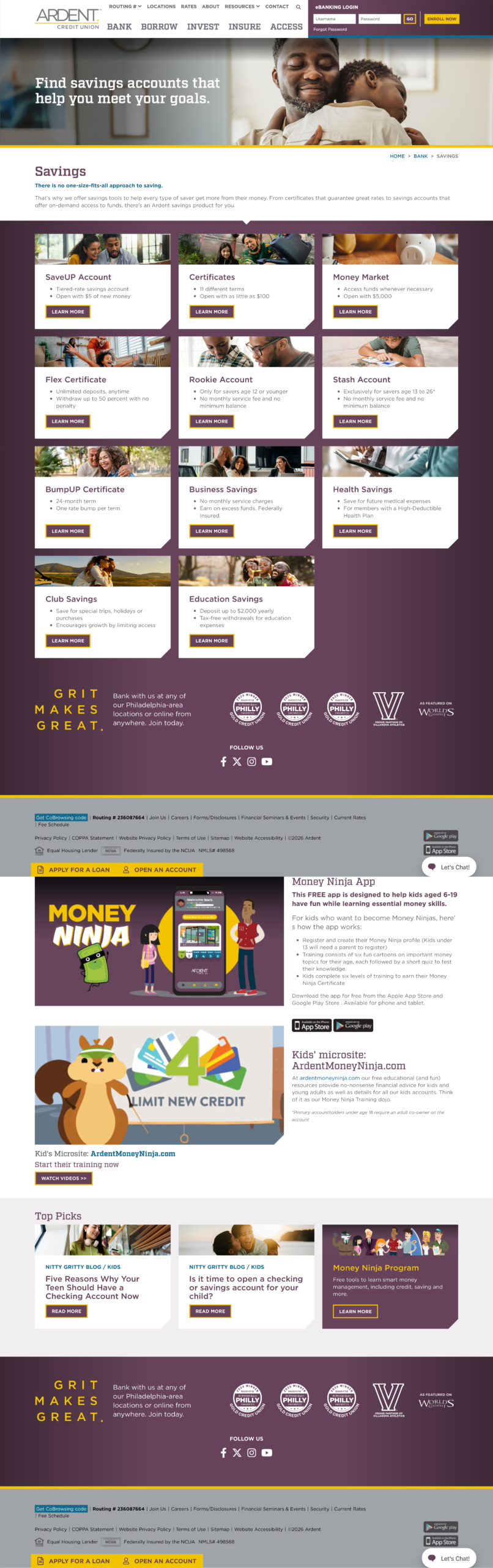
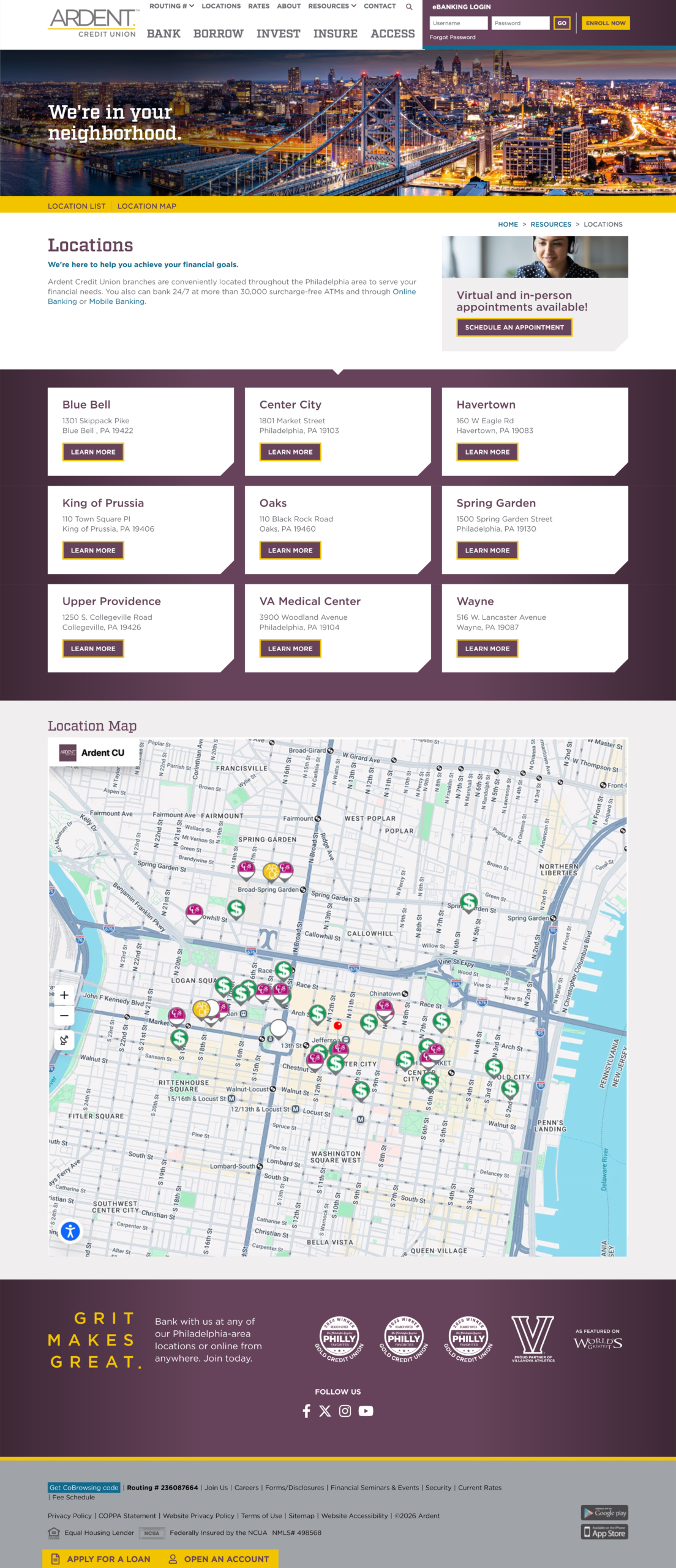
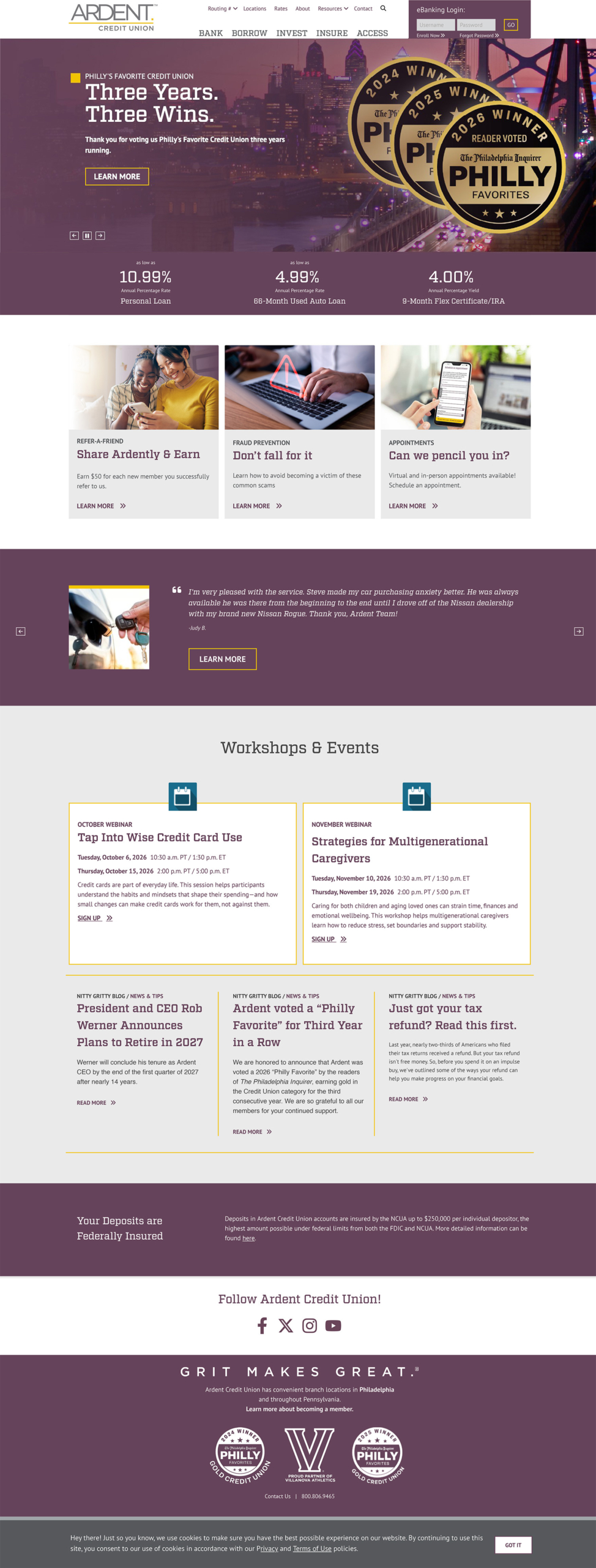
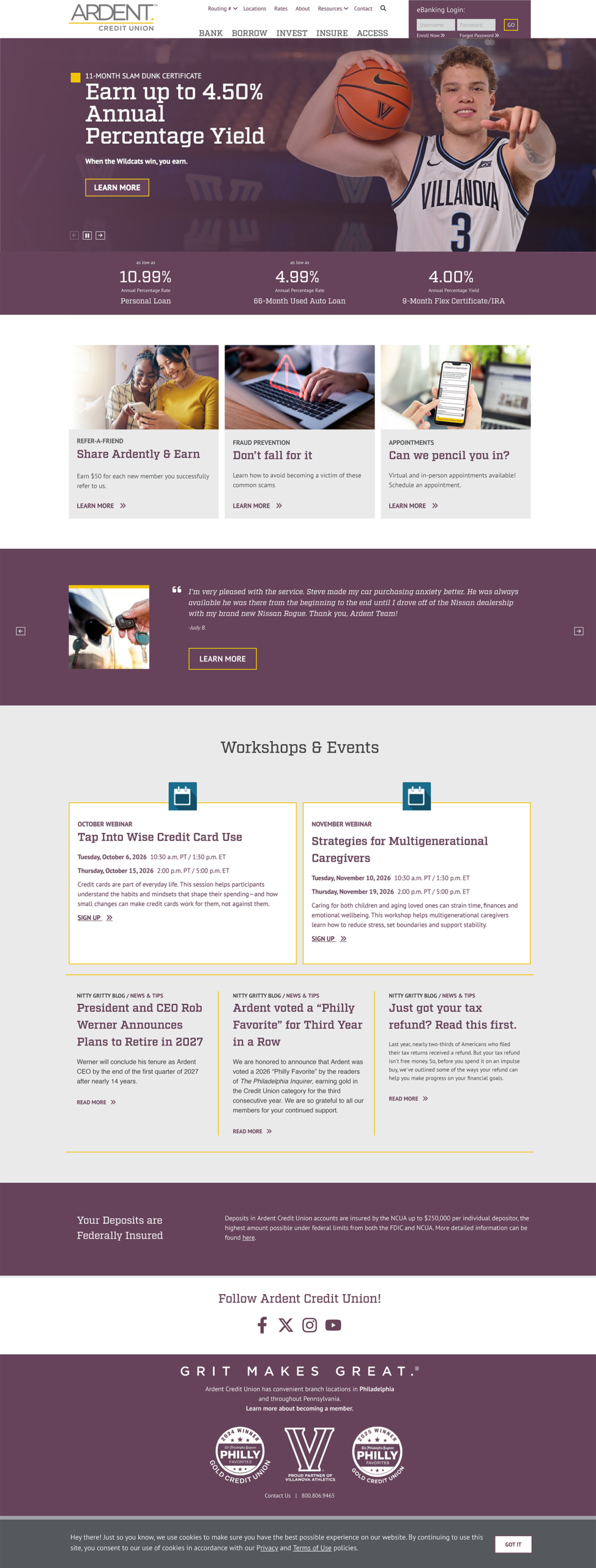
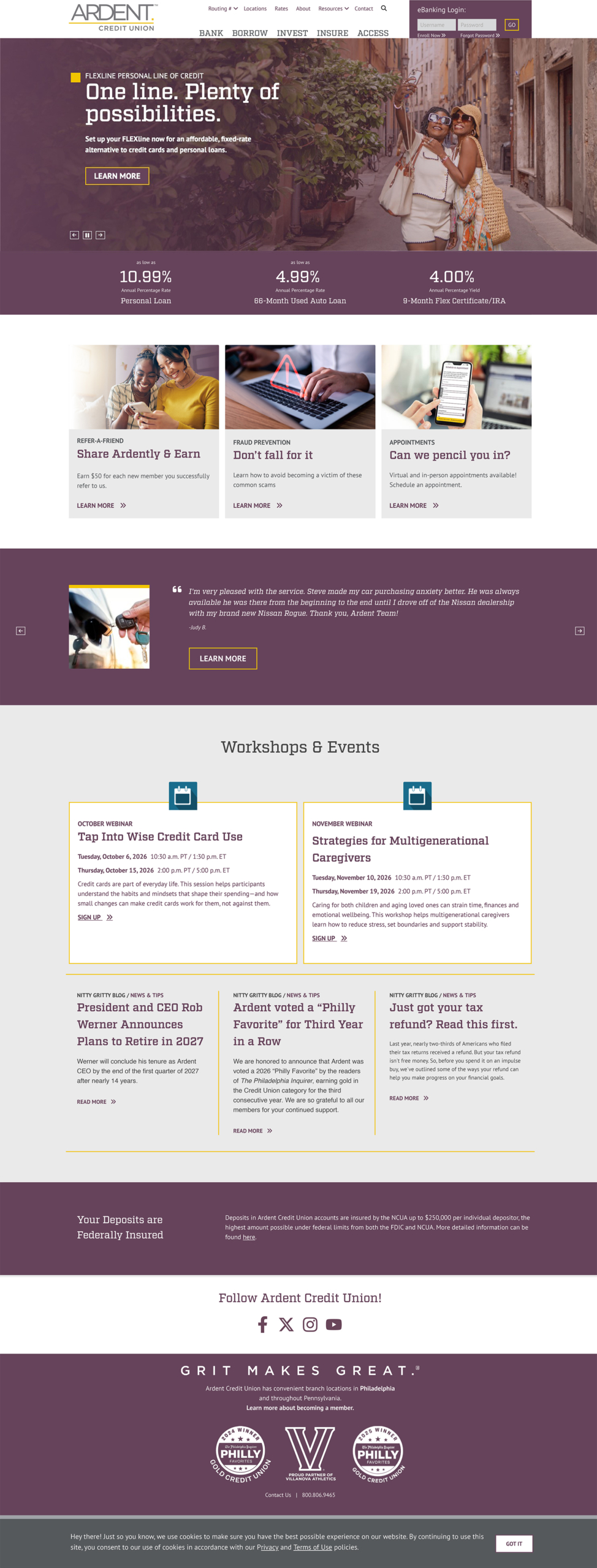
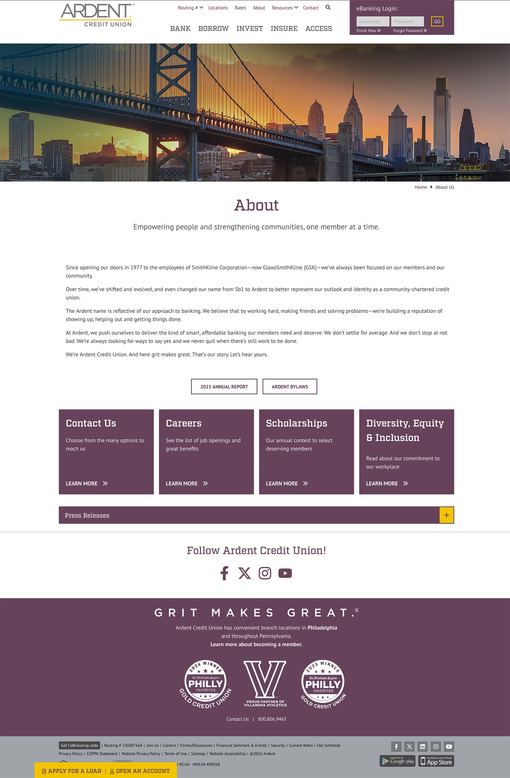
The redesigned experience brings greater energy and cohesion to the website, from its campaign-driven homepage to its banking and product-category pages.
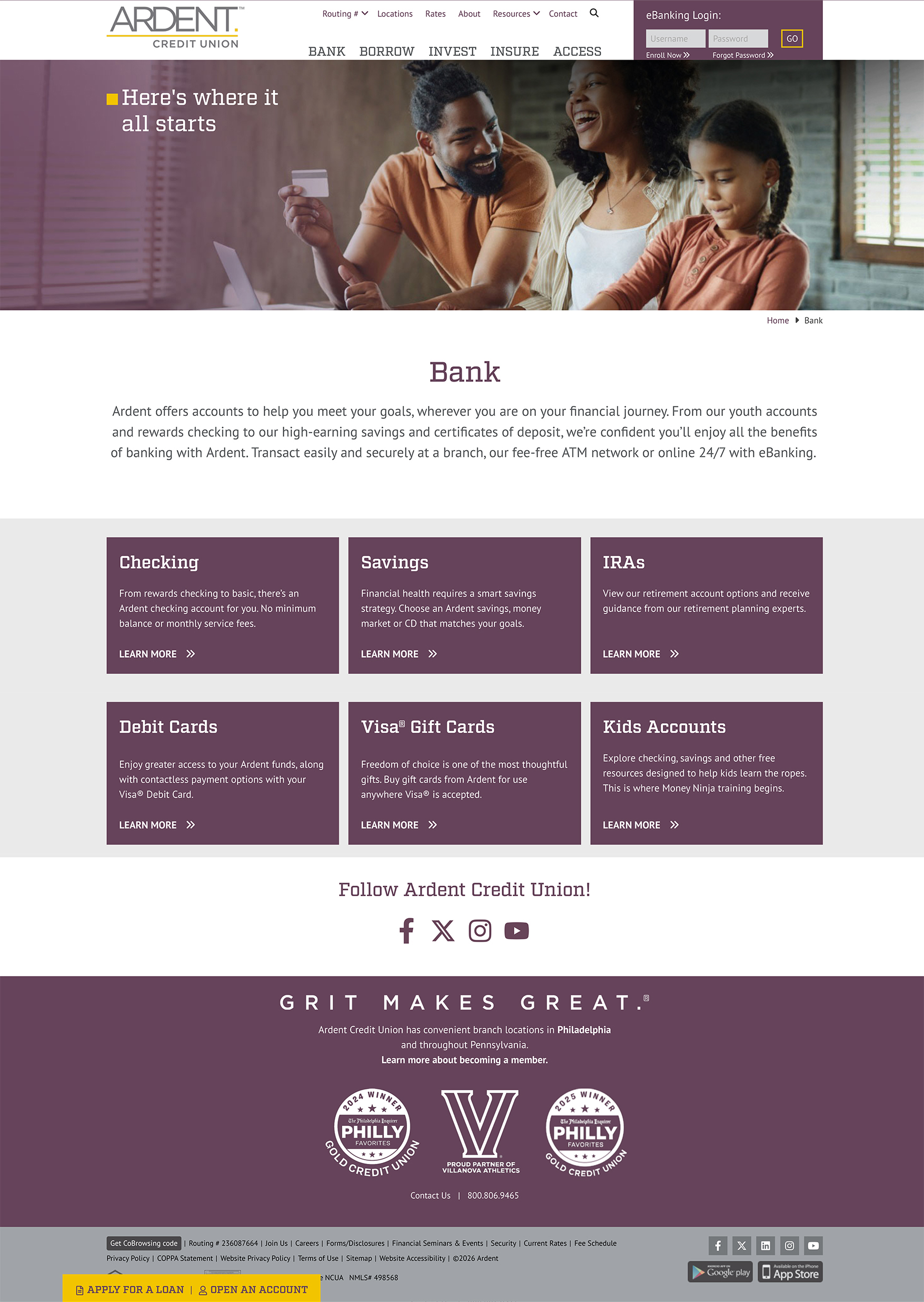
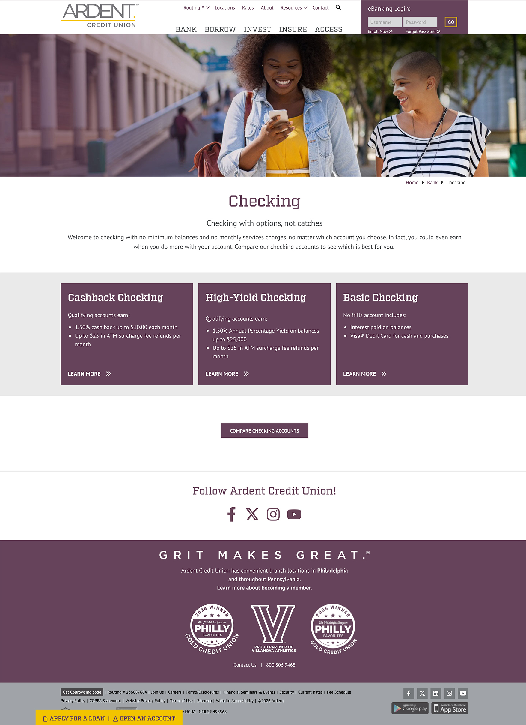
Bold imagery, more deliberate typography, and distinctive color treatments create a stronger visual presence. Refined content components help establish consistency while giving products, promotions, and member resources their own space within the experience.
The banking section demonstrates this approach through a structured presentation of account categories and featured products, making the breadth of Ardent’s offerings easier to explore.
Across the site, the updated visual language creates a stronger relationship between Ardent’s marketing communications, brand identity, and digital presence.
Phase One: A Foundation for What’s Next
This launch represents the first phase of a broader digital evolution.
While the initial effort establishes the visual direction and UI foundation, the next phase will focus more deeply on information architecture, content strategy, and product discovery.
The opportunity ahead is to create more intuitive pathways that help members and prospective members understand their options, identify relevant financial solutions, and take meaningful action.
It’s an approach that recognizes an important distinction: a successful digital experience isn’t defined by aesthetics alone. It depends on how effectively design, content, technology, and business objectives work together.
The Bigger Picture
For me, the most interesting part of this project is the opportunity to build on an evolving brand rather than treat the website as a standalone initiative.
Strong brands need consistency, but they also need room to grow. Every touchpoint should reinforce the same identity while responding to the unique needs of its audience.
Ardent’s redesigned website is another step in that evolution—bringing greater clarity, character, and cohesion to its digital presence while laying the groundwork for what’s next.
Because great design doesn’t just make a brand look better. It makes the brand work harder.
Explore the live website: https://www.ardentcu.org/
CREATIVE DIRECTOR